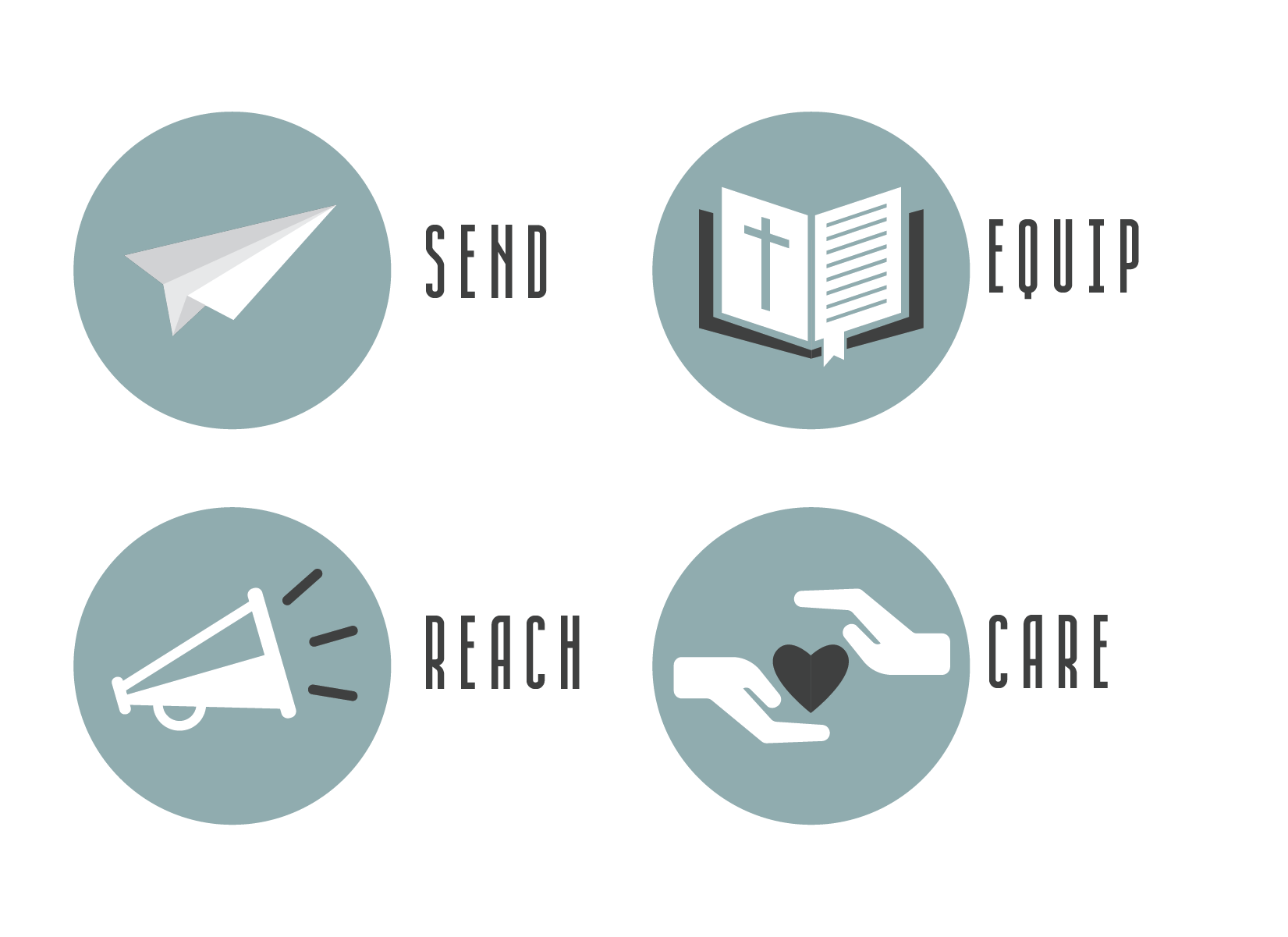
These four icons represent what the churches goals were with their audience.
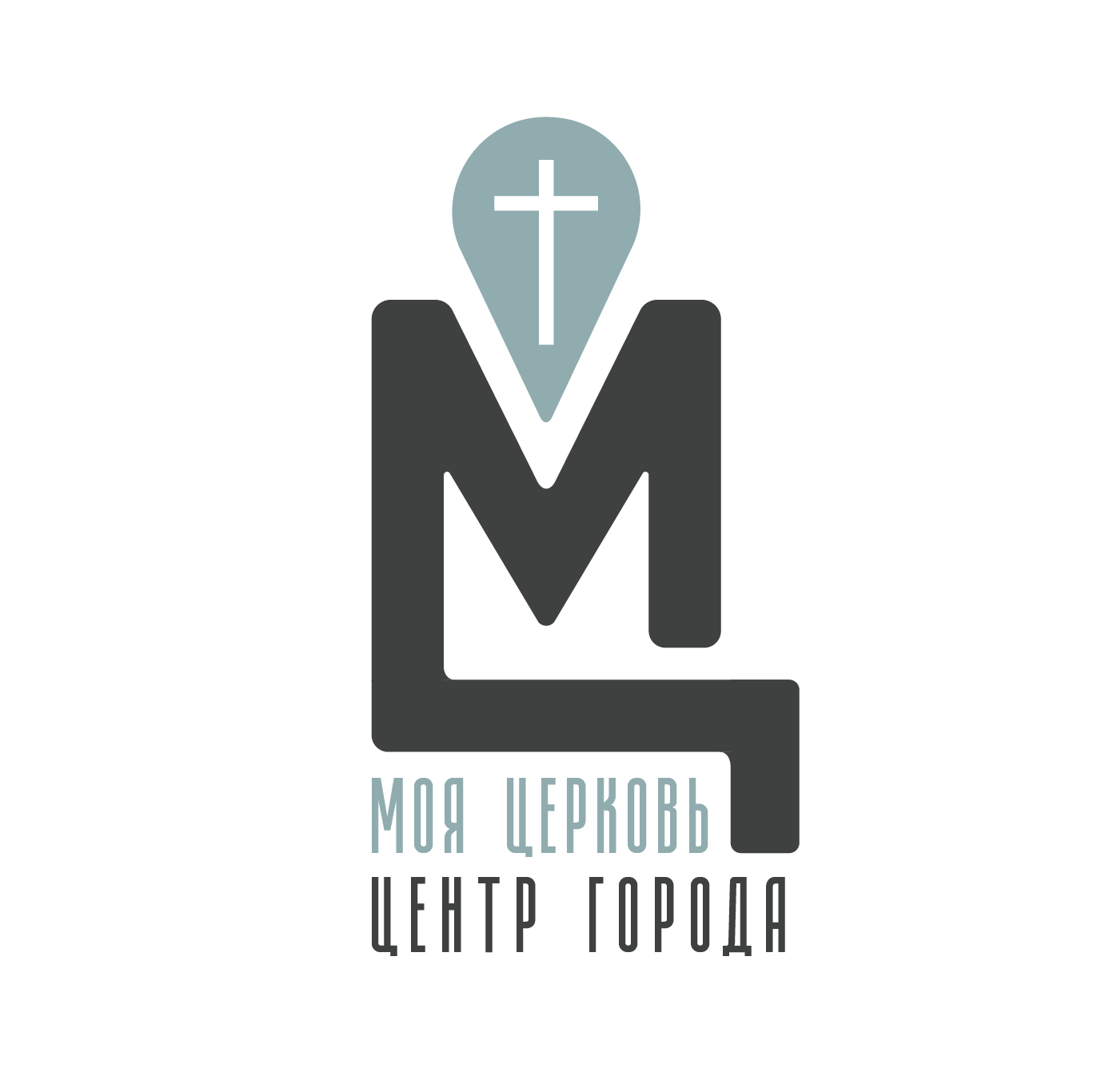
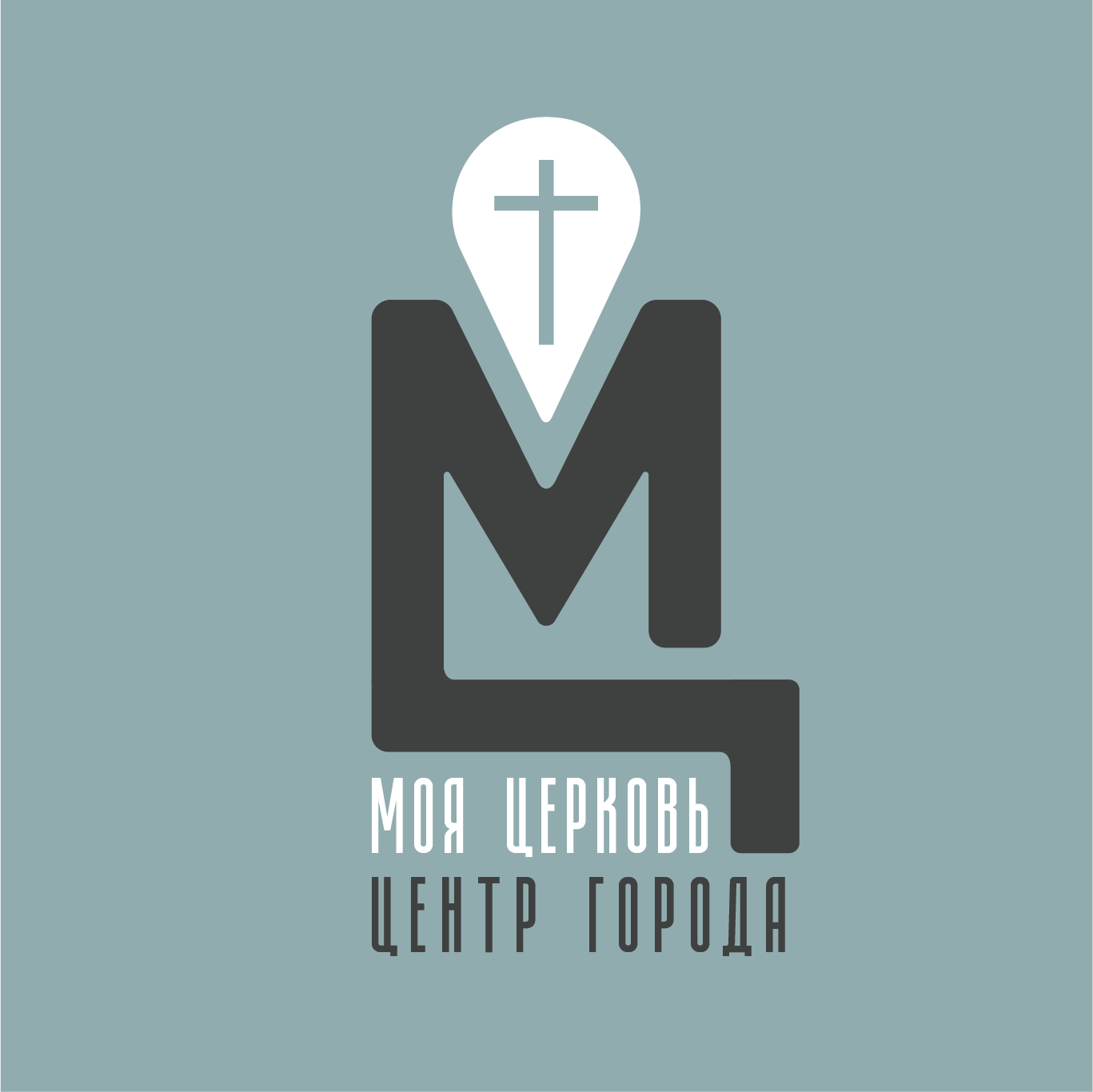
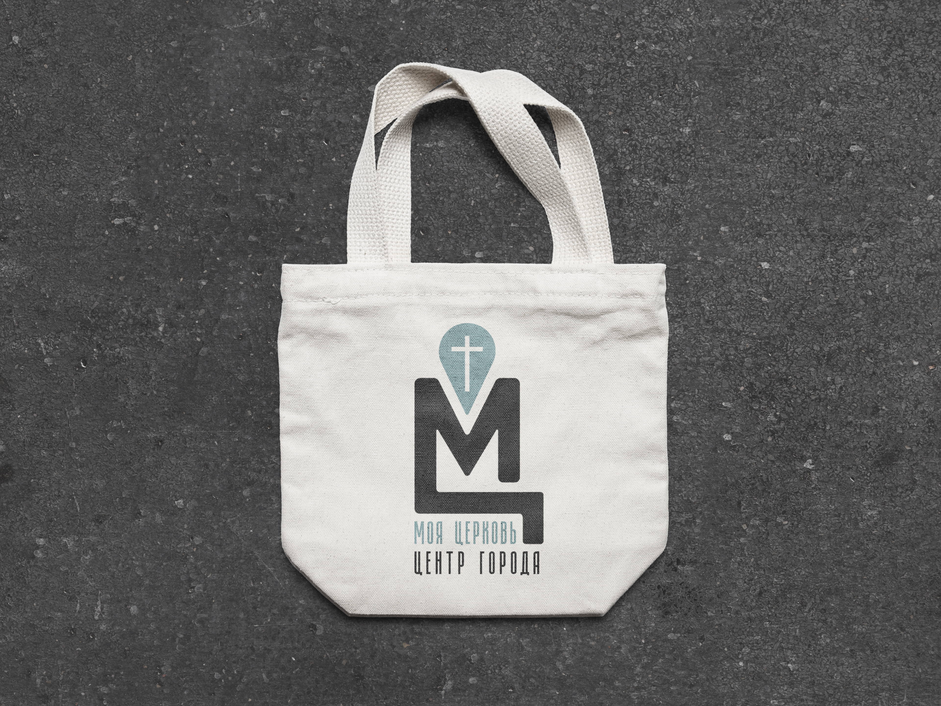
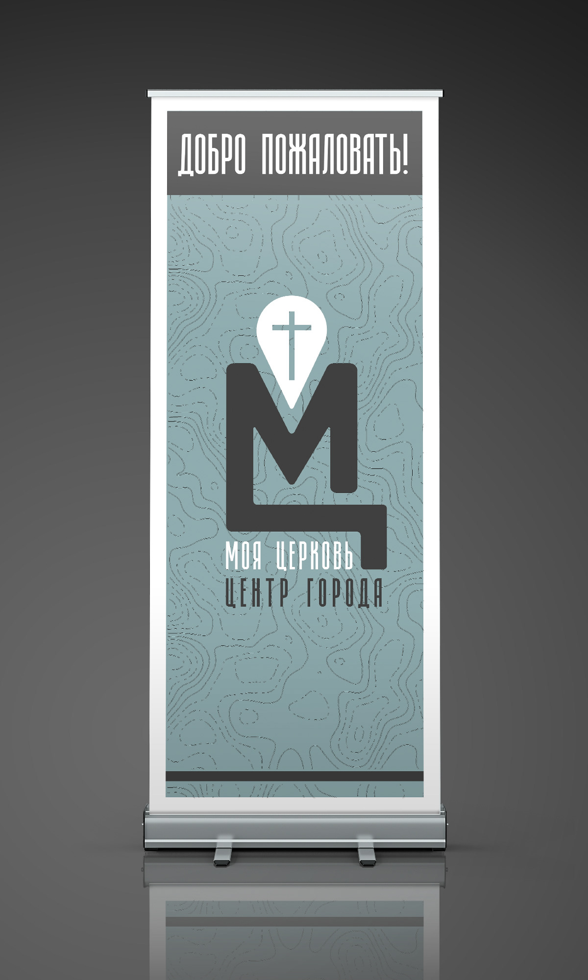
The logo is a combination of the letter M and the letter C in the Russian language. I chose this because the name of the church "My Church" start with the letter M in "my" and the letter C in "church".
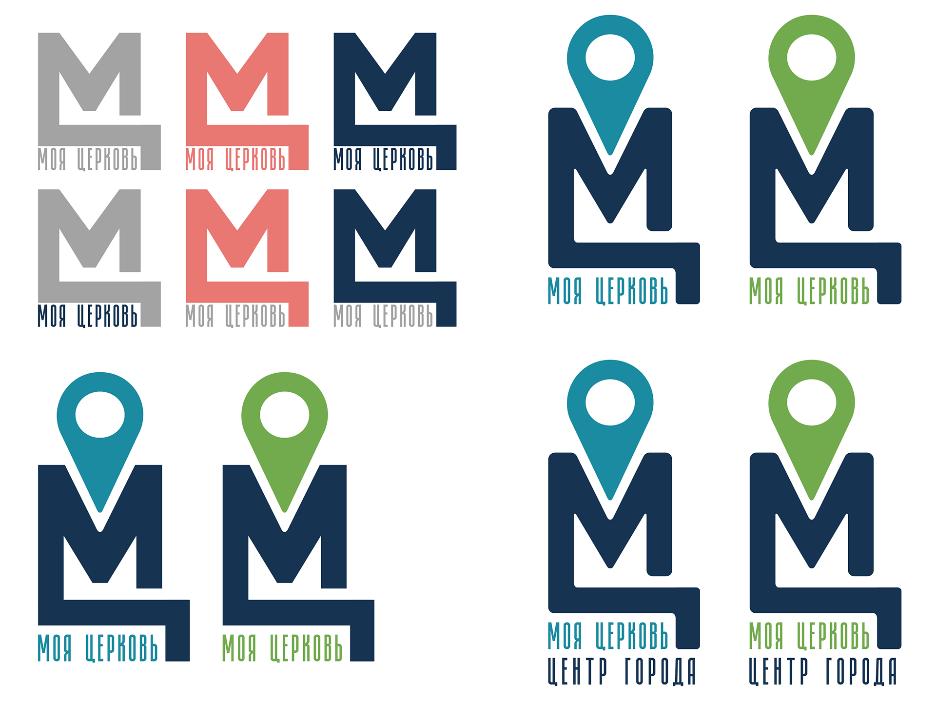
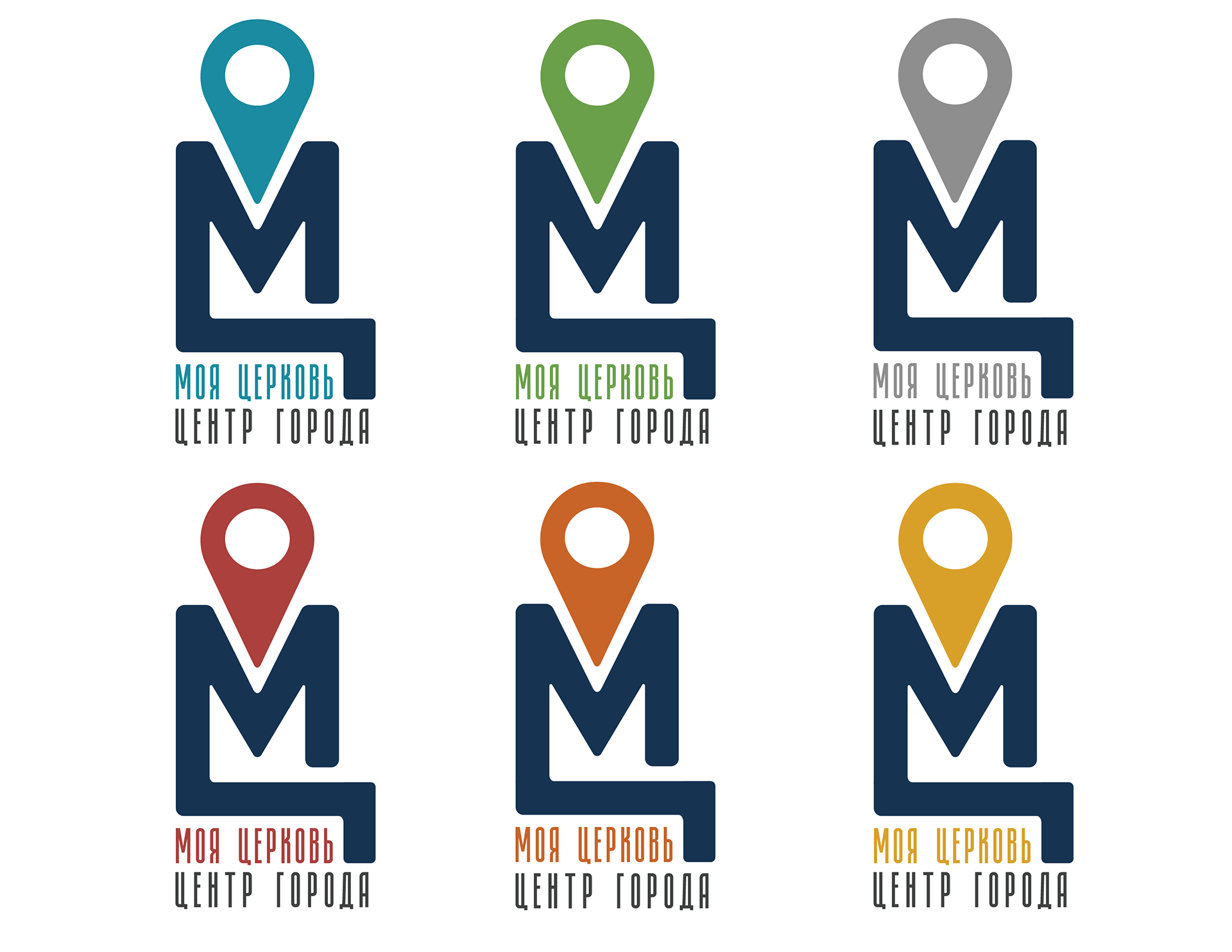
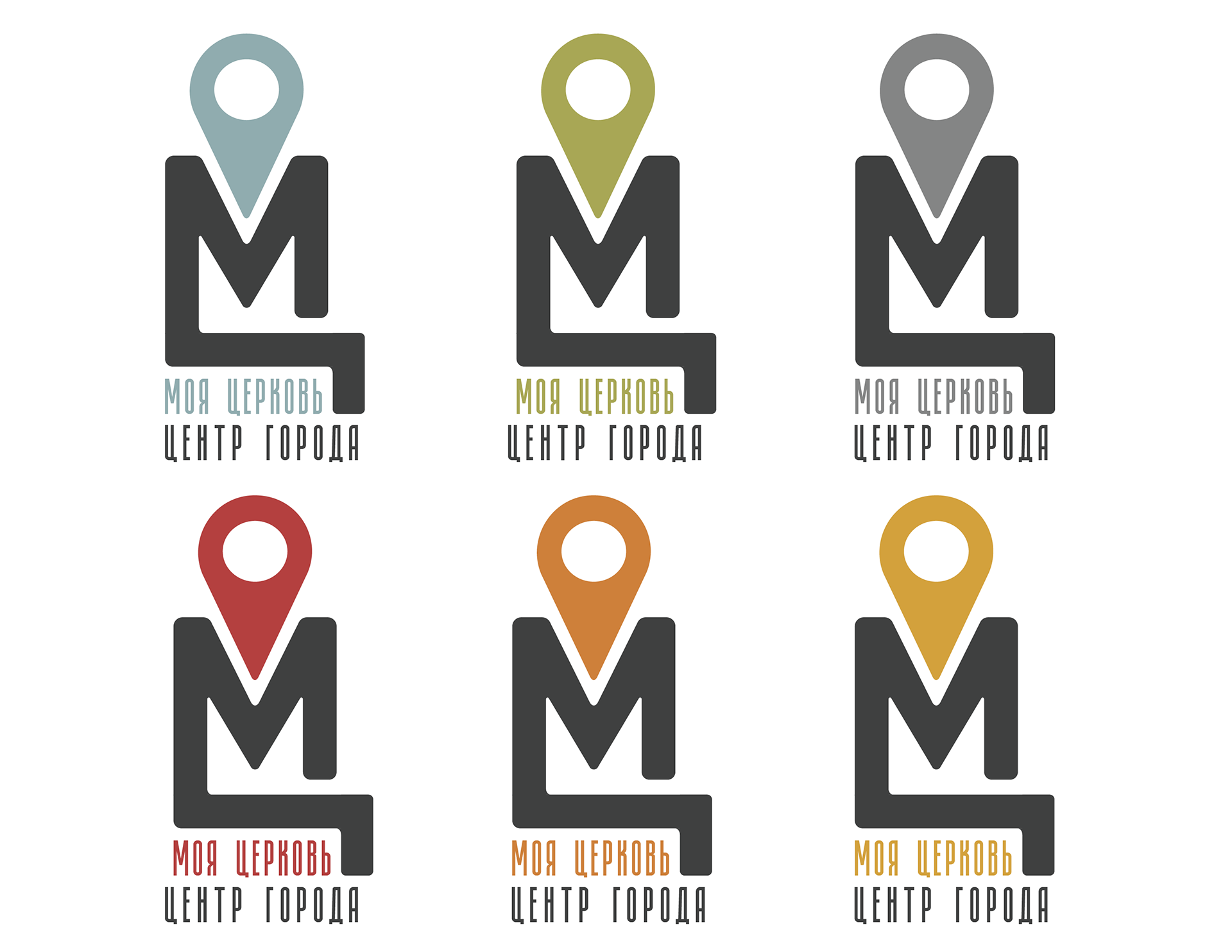
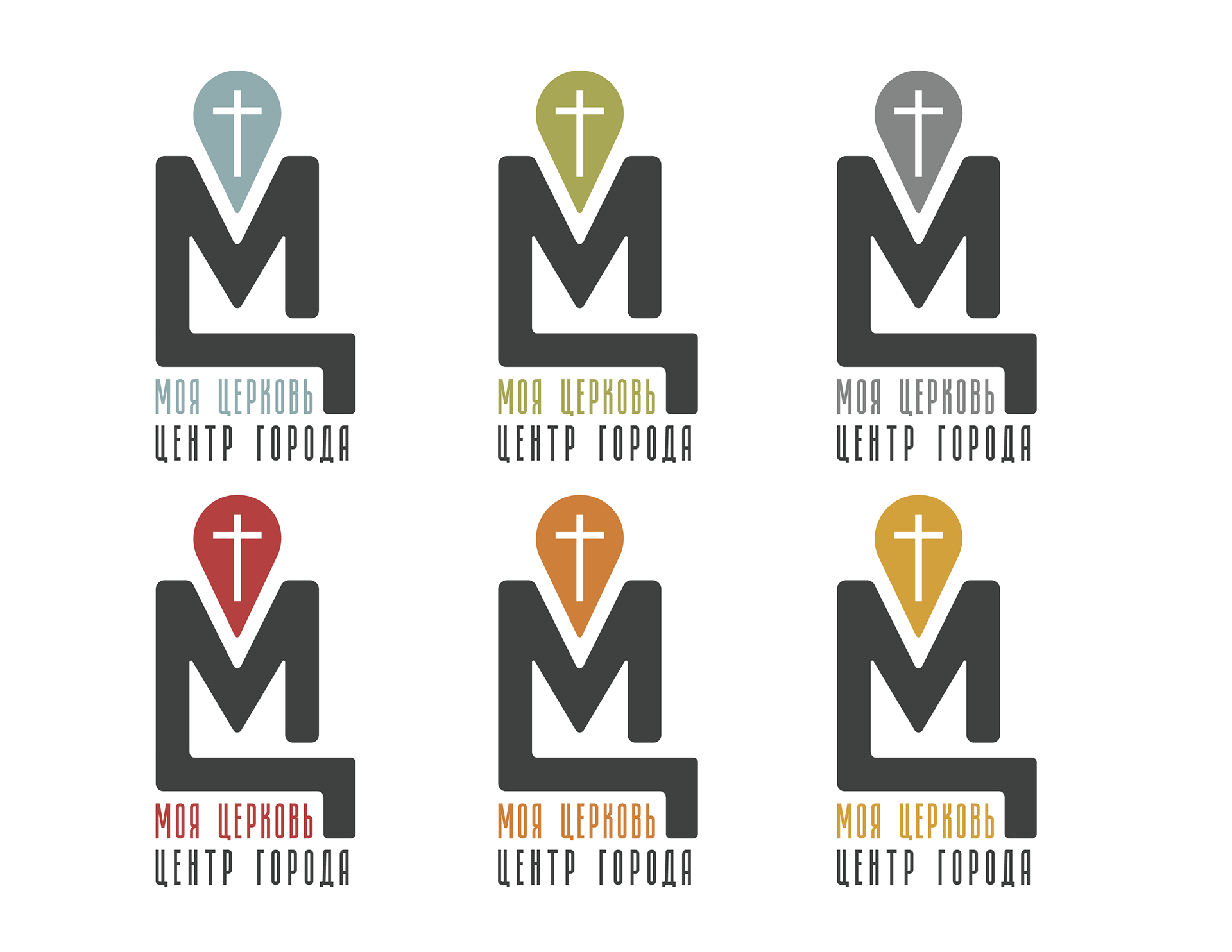
From left to right, is each section I worked on until I got the final logo. Once I got the basic shape of the logo done, I showed my options to the senior pastor and he chose which logo he liked best, I showed him a few color schemes I put together and created the rest of the logos in the schemes he liked the best.